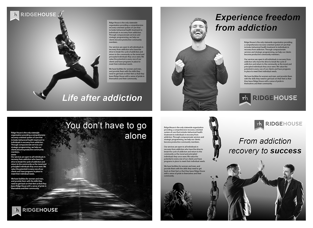
 Non-Profit Organization Advertisement
This poster advertising a non-profit organization was an exercise in creating a dynamic grayscale layout, since sometimes advertising must be accomplishied using a smaller budget.
The requirements included combining three different photographic images, the organization's logo, and text. While the body copy was taken from the organization's website, the headlines are my own.
Typefaces (not including preexisting logo): Palatino Linotype family, Callaghands, Myriad Pro


